RoamHR — 2018
RoamHR
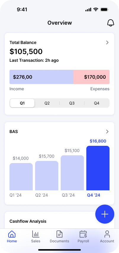
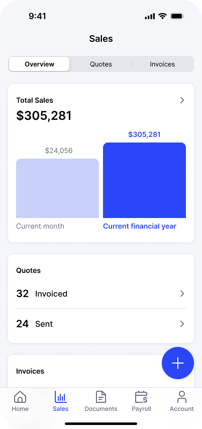
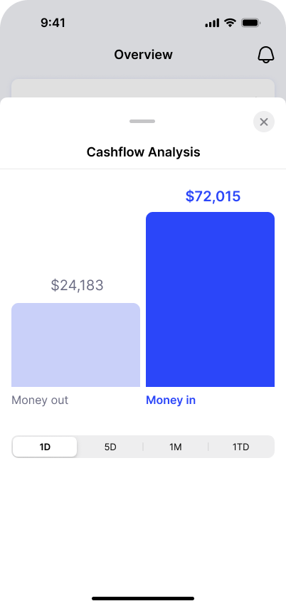
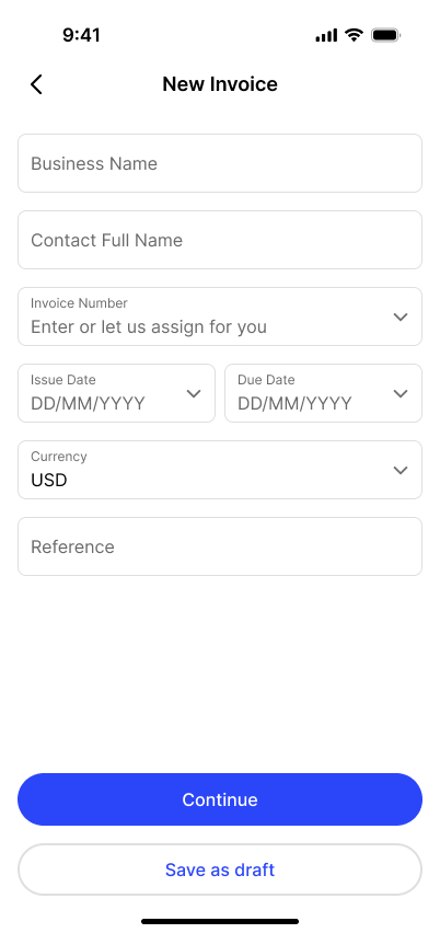
Brand, UX, and UI for a fintech startup giving American freelancers one place to bank, invoice, track mileage, and save for taxes — grown from 14 users to 650+ and ultimately acquired.
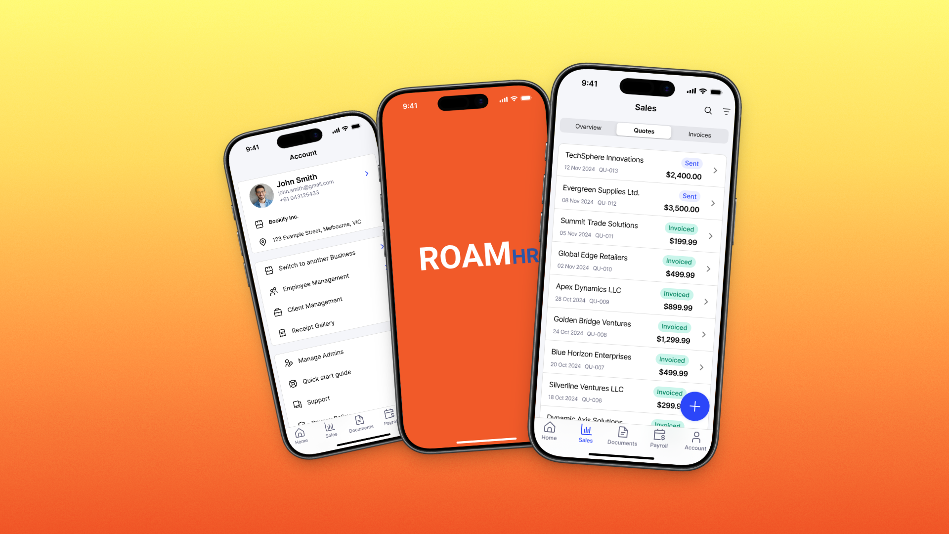
RoamHR set out to fix the financial mess of freelancing. With more than fifty million Americans working gig and independent jobs, the tools for managing that money — banking, invoicing, mileage, quarterly taxes — were scattered across apps that never talked to each other and never taught anyone anything.
Working directly with founder and CEO Rick C. in 2018, I delivered the brand and the product design for the platform in a four-week engagement: research, wireframes, high-fidelity UI, and multiple rounds of usability testing.
The problem
Freelancers live with a financial burden that traditional banking ignores. Income arrives irregularly from multiple clients, business miles disappear untracked, and the quarterly tax bill lands as a surprise because nobody ever explained estimated payments. The tools that existed each solved one sliver of the problem, which meant a freelancer needed four or five subscriptions and still had no complete picture.
For a lean startup, the design challenge was compressing all of that into a single product that felt trustworthy enough to hold someone’s money — without the intimidating density of traditional finance software.
What I did
I started by listening: interviews with more than fifteen freelancers across different industries, mapped against competitor research to find what the fragmented tools were each missing. Those conversations shaped the product’s core bet — that education had to be a feature, not a help page. Tax savings, quarterly payments, and deduction tracking were designed as guided experiences rather than raw data screens.
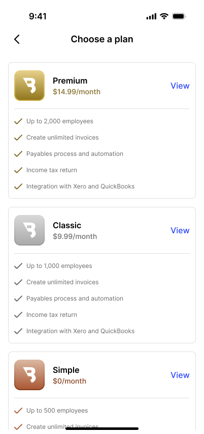
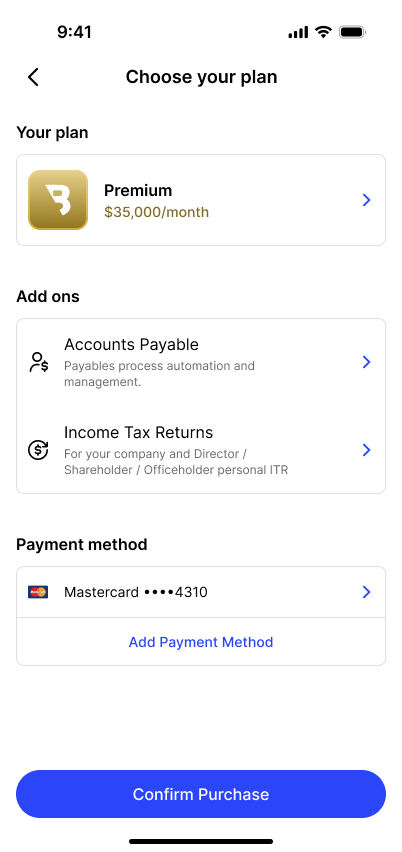
From early wireframes through several rounds of usability testing, the interface was refined toward three qualities the research kept surfacing: clarity, trust, and momentum. Banking, invoicing, mileage tracking, and tax management live in one consolidated flow, so the freelancer sees one financial life instead of four disconnected ledgers.
The design scope ran past the app itself. RoamHR’s second audience was the banks, and the marketing site made that pitch in the brand’s confident orange and institutional blue: white-label RoamHR’s features to compete with challenger banks, integrated into existing cores like Fiserv DNA through the platform’s APIs. One design language had to sell trust in two directions — to the freelancer holding their money in the app, and to the bank partner putting its name on it.
What changed
RoamHR grew from 14 active users to more than 650, built strategic partnerships with financial institutions, and measurably increased users’ tax savings through its quarterly payment education. The company was ultimately acquired — the cleanest validation a lean startup design can get.