Keeney — 2026
Keeney — Marketing Website
Brand and website design for a values-driven Northeast Ohio web services company — a site that sells restraint: real prices on the homepage, values written as commitments, and every path ending at a self-serve configurator instead of a sales call.
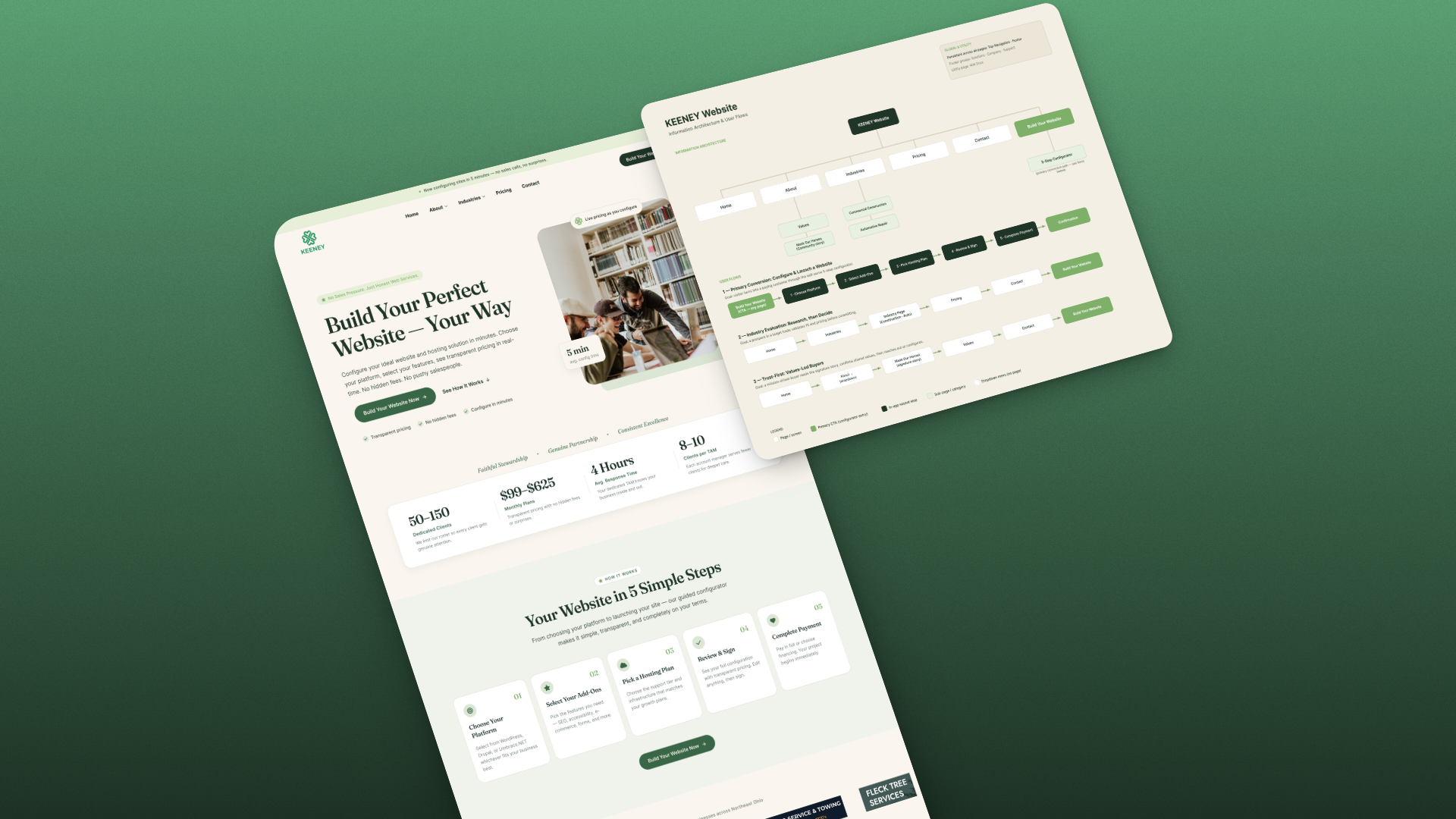
Keeney is a web services company built on an unusual promise: a deliberately limited client roster, transparent pricing, and no sales pressure — websites and hosting for the small businesses of Northeast Ohio, built with care and billed without surprises. I designed their brand and marketing site in Figma: the clover identity, the full information architecture and user flows, and the page system from homepage through industries, pricing, and contact.
The problem
Web services is a market that sells with hype — unlimited everything, aggressive funnels, salespeople who call before the form is submitted. Keeney’s actual differentiators run the opposite direction: a capped roster so every client gets attention, pricing published to the dollar, and values the owners genuinely run the business by. Claims like that read as marketing copy unless the design proves them.
An earlier draft of the site proved the wrong instinct — heavy, dark, and corporate, it felt like a bank when the audience is auto repair shops, construction firms, and tree services in Northeast Ohio. The redesign had to feel like the company actually is: warm, local, and honest enough to put its prices on the front page.
What I did
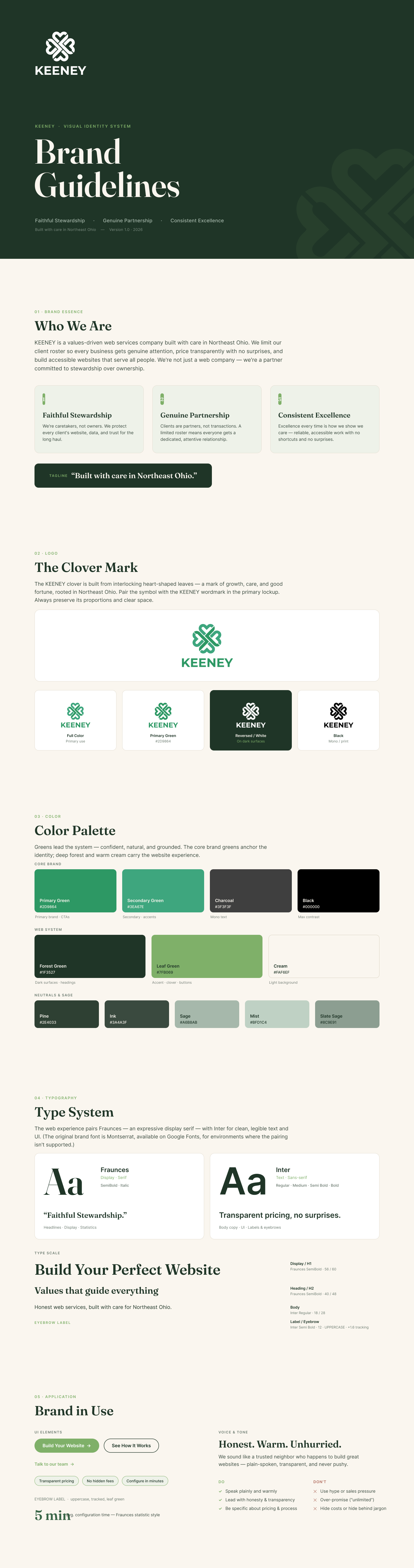
The identity starts with the clover mark — four interlocking heart-shaped leaves, growth and good fortune in one form — carried by a palette of warm cream, sage, and deep forest, with Fraunces bringing editorial warmth against Inter’s plain-spoken clarity. The voice rule from the brand guidelines governs every headline: honest, warm, unhurried.
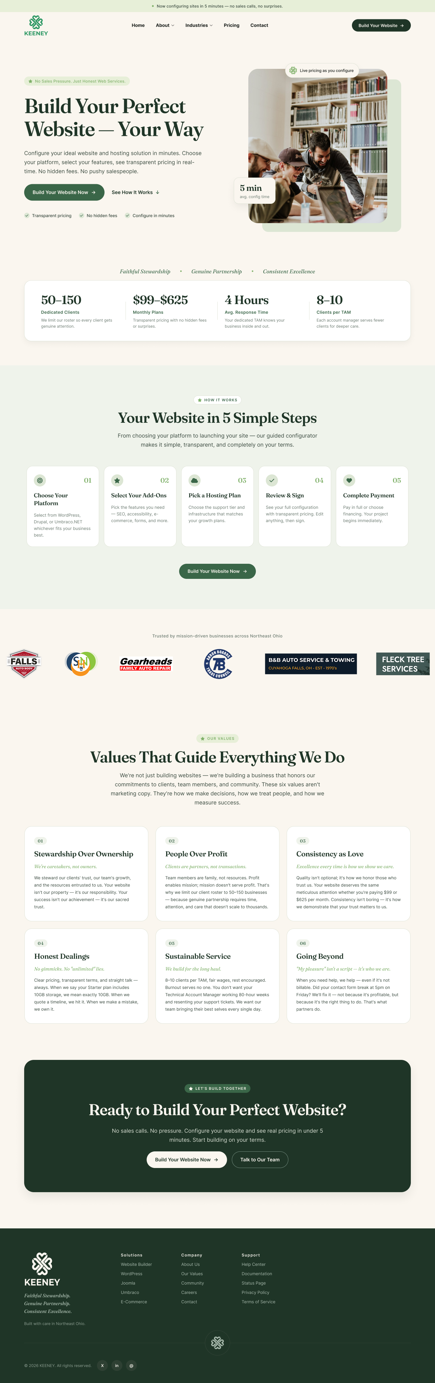
The homepage argues with numbers instead of adjectives — roster size, monthly pricing range, response time, and clients per account manager sit directly under the hero, followed by values written as verifiable commitments rather than platitudes. The information architecture was designed around three documented buyer journeys: the visitor ready to configure now, the tradesperson researching their industry fit first, and the values-led buyer who reads the story before anything else. All three flows, mapped end to end, terminate at the same place: Build Your Website.
What changed
Keeney has a complete, build-ready design package: brand guidelines v1.0, the mapped information architecture with three user flows, and the full page system across home, industries, pricing, about, and contact — every screen already speaking the voice the company wants to be known for.