HeyBud — 2024
HeyBud
A two-week UX/UI audit and redesign for an Australasian skincare brand scaling up — turning an inconsistent storefront into a cohesive, trust-building experience.
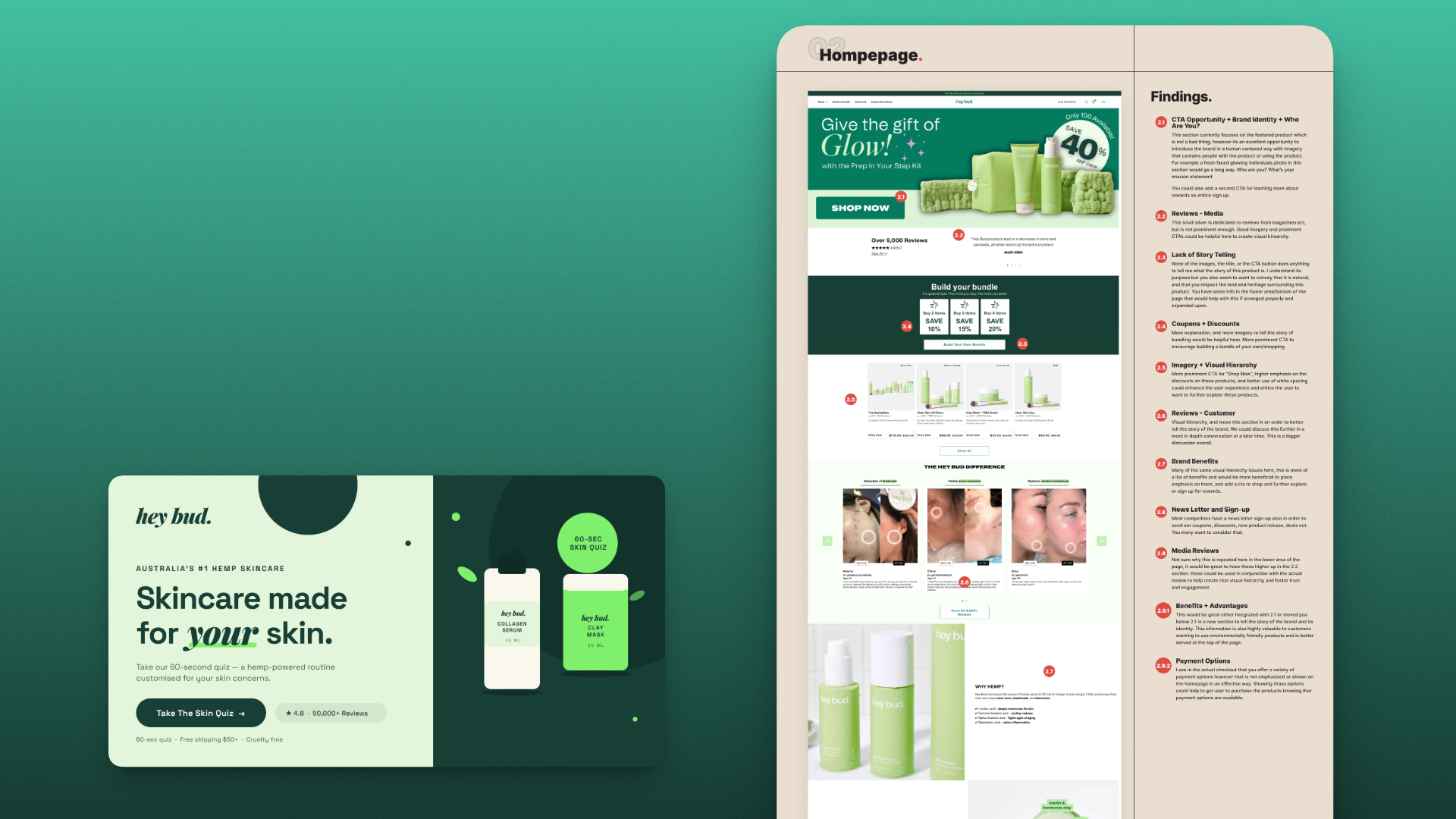
HeyBud is a skincare brand based in New Zealand and Australia that had outgrown its website. As the business expanded in late 2024, the digital experience needed to catch up — clearer, more consistent, and better at earning the trust a skincare purchase requires. Over two weeks I led a comprehensive UX/UI audit and delivered the redesign on WordPress.
The problem
Skincare is a trust purchase — customers are putting a product on their face on the strength of a website’s word. HeyBud’s existing experience undercut that trust in small, compounding ways: inconsistent components, uneven typography and spacing, off-brand color usage, and conversion paths that asked customers to work harder than they should. None of it was broken outright, which is exactly what makes that kind of erosion easy to ignore and expensive to leave alone.
What I did
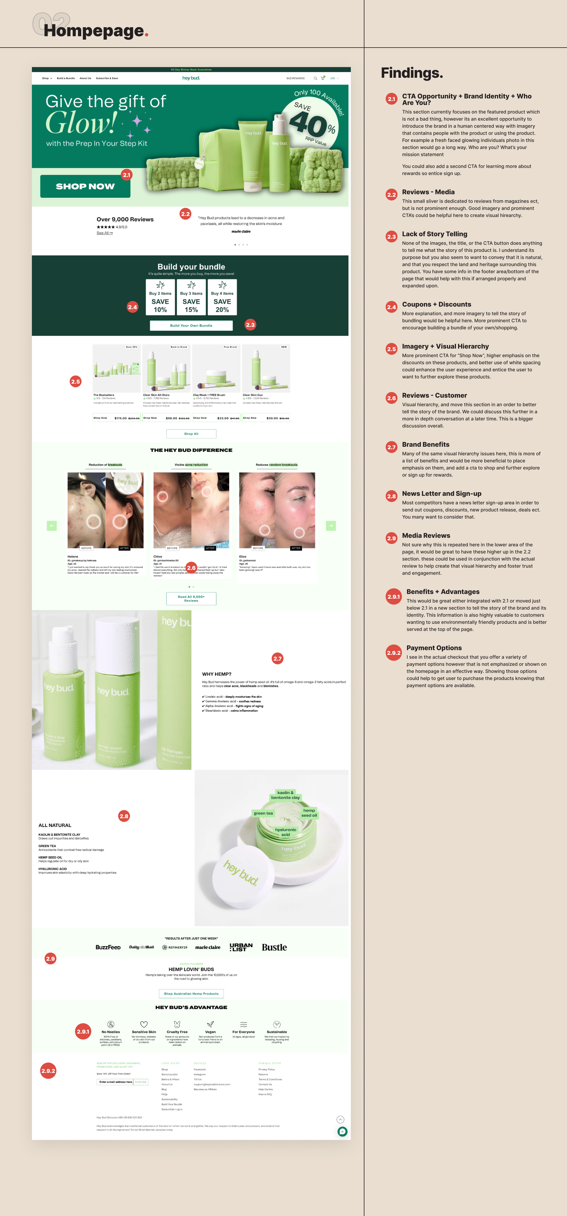
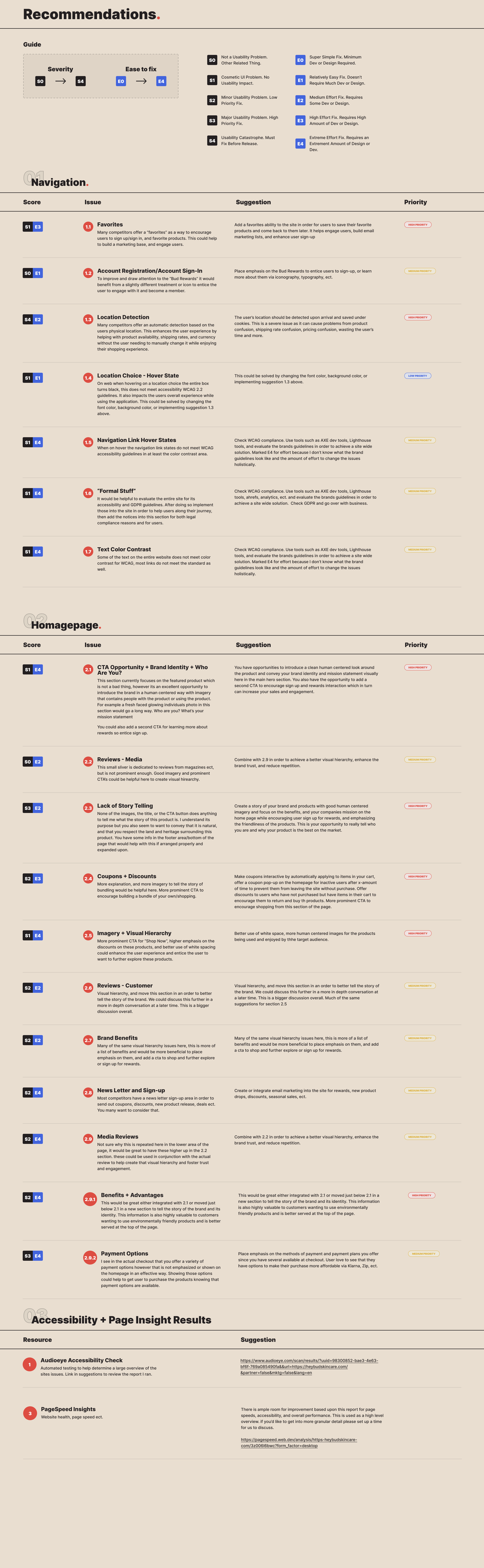
The engagement opened with a comprehensive audit covering layout, typography, spacing, color, component consistency, brand alignment, accessibility, and every conversion path on the site. Every finding carried two scores — severity, from cosmetic to catastrophic, and ease of fix, from a design tweak to a rebuild — so the recommendation sheet reads as a sequenced plan where the highest-impact, lowest-effort wins surface first. AudioEye accessibility scans and PageSpeed diagnostics backed the visual findings with hard evidence.
The redesign then translated those priorities into high-fidelity layouts and refined UI components — stronger page structure, cleaner visual hierarchy, and more confident calls to action — balancing the credibility skincare customers need with the warm, modern personality the brand is known for.
What changed
HeyBud came away with a clearer, more cohesive digital experience: pages that scan effortlessly, a consistent component language across the site, stronger product education, and a brand presentation that finally matches the quality of what’s in the bottle.