Fast Horse — 2024
Fast Horse
An offline-first iPad check-in system for performance racing events — built to replace paper sign-in sheets, be learnable by brand-new staff in minutes, and run for about $9K a year where SaaS wanted $42K. Shown rebranded; the client stays confidential.
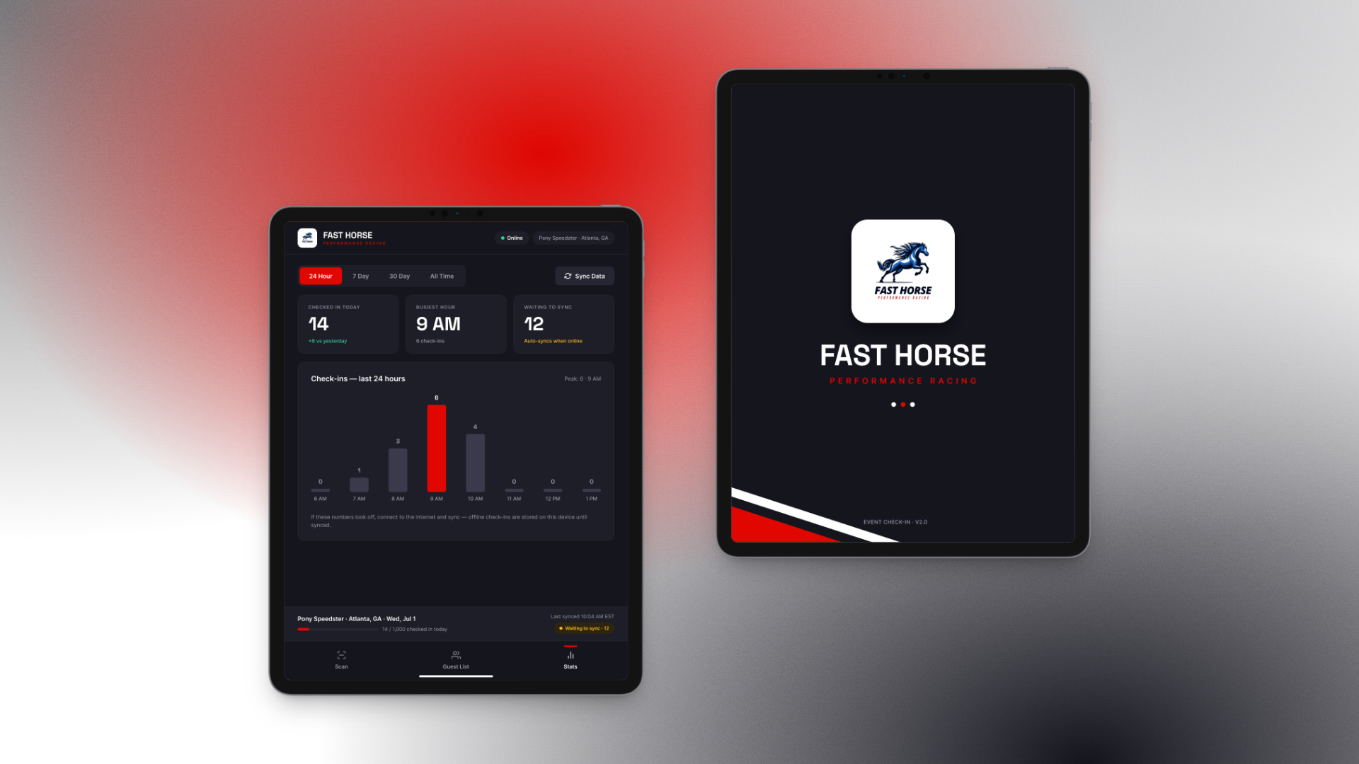
A client in the performance racing business ran every event check-in on paper and pen. I designed their replacement: an iPad station system for the gate, built around one screen staff live in and one red button they press. The work shown here is real — but the client’s name, colors, and logos are confidential, so the system appears rebranded as Fast Horse Performance Racing. I can say more about the client in conversation.
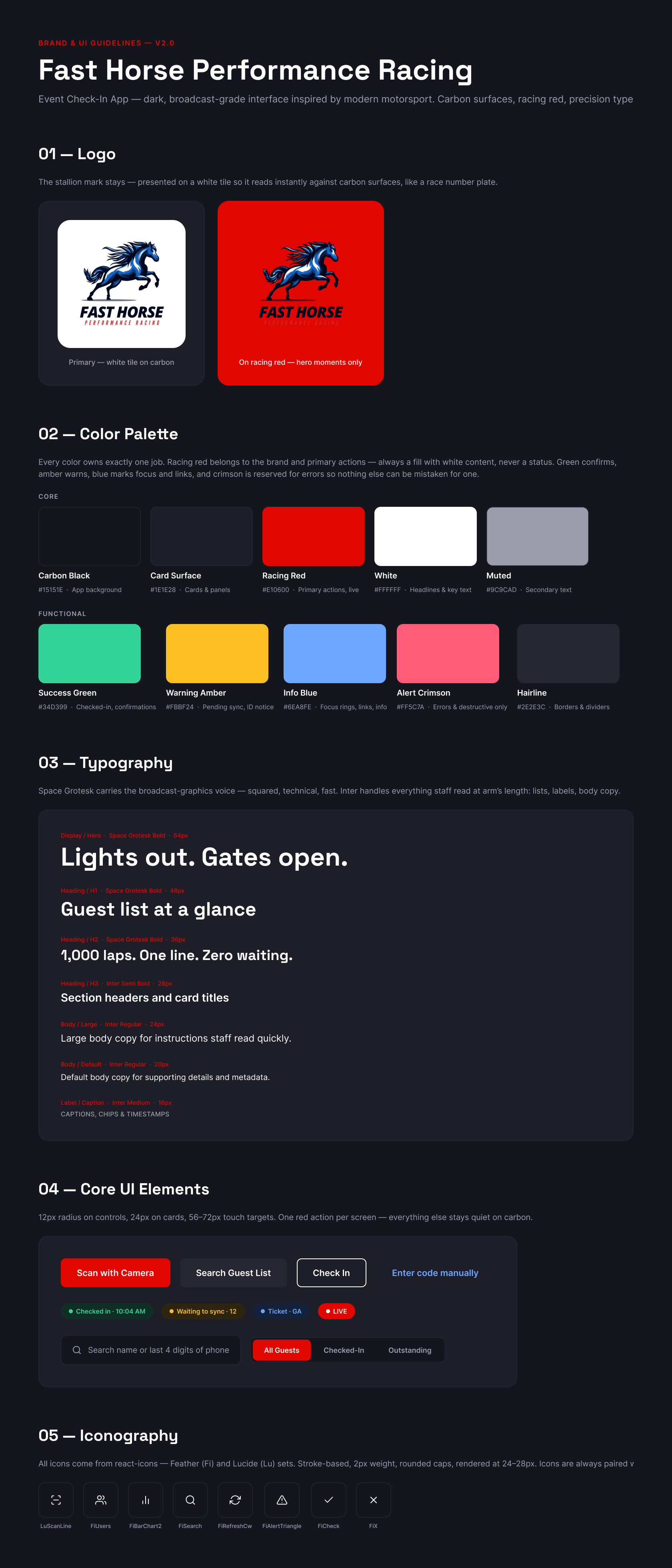
The design runs from brand system to shipping screens: the carbon-and-racing-red identity, the guest list and walk-up registration flows, the stats dashboard event ops runs the day on, and the guidelines a React build implemented from.
The problem
Every event, a folding table, a stack of printed lists, and a pen. Paper check-in wasn’t just slow — it was expensive in the ways that compound. Each event needed staff hired locally, which meant permanent turnover: every weekend brought people working their first day, and training them on the paper process cost real money while the error rate stayed high anyway.
The obvious answer — buy event check-in SaaS — failed on arithmetic. The quotes came to roughly $42,000 a year, forever, for a business that runs a defined calendar of events. They needed software that fit how they actually operate: owned, not rented, and usable by someone who learned it four minutes ago at a folding table with bad cell signal.
What I did
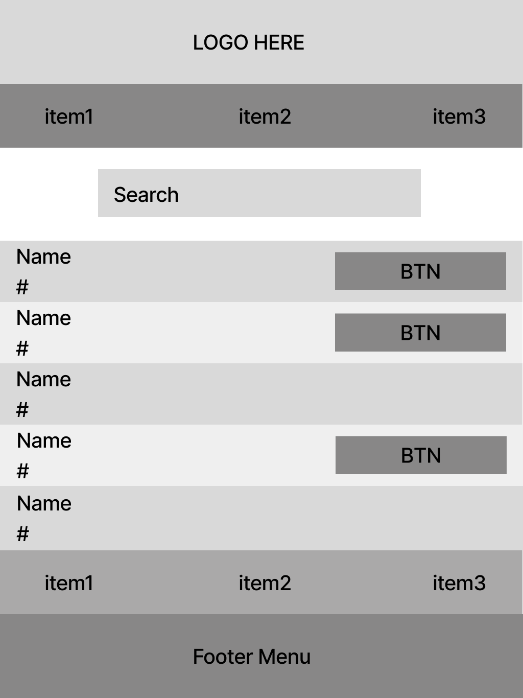
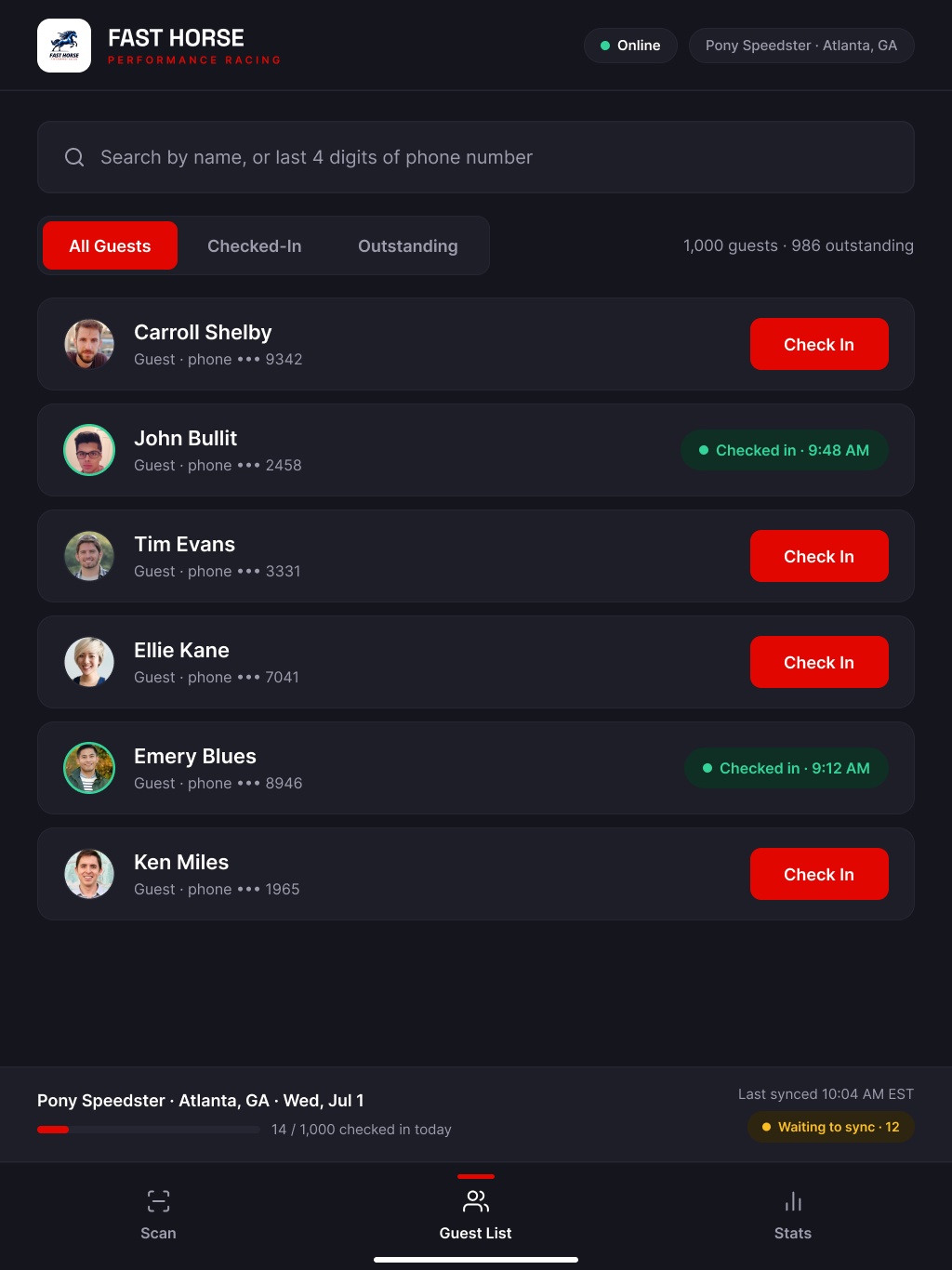
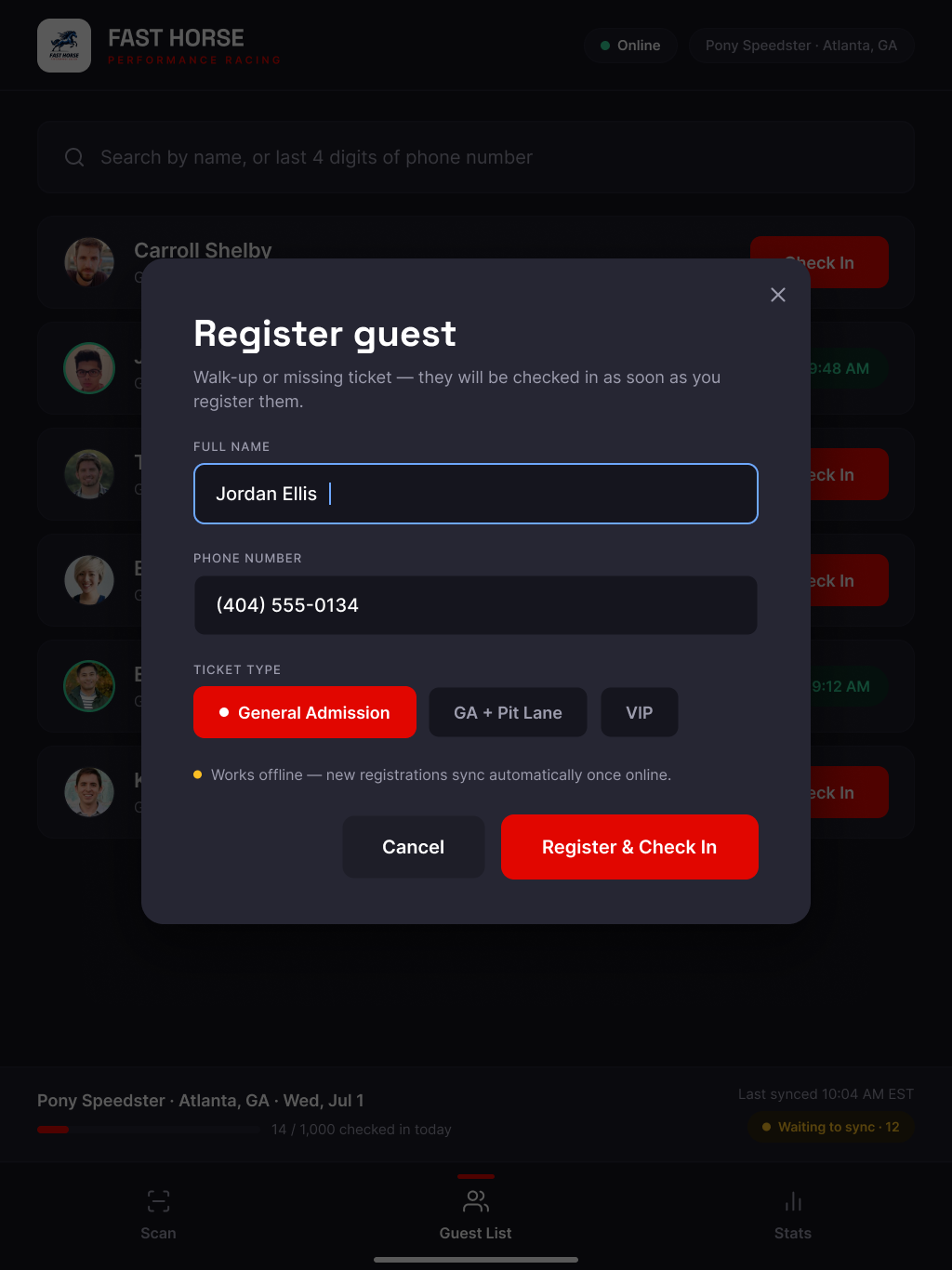
The design treats zero training as the core requirement. Staff get one screen — the guest list — and one question to ask: a name, or the last four digits of a phone number. Every screen has exactly one red action; everything else stays quiet on carbon. Touch targets run 56 to 72 pixels for gloved and hurried hands, and walk-ups — the paper system’s biggest failure point — become a single modal that registers and checks in at once.
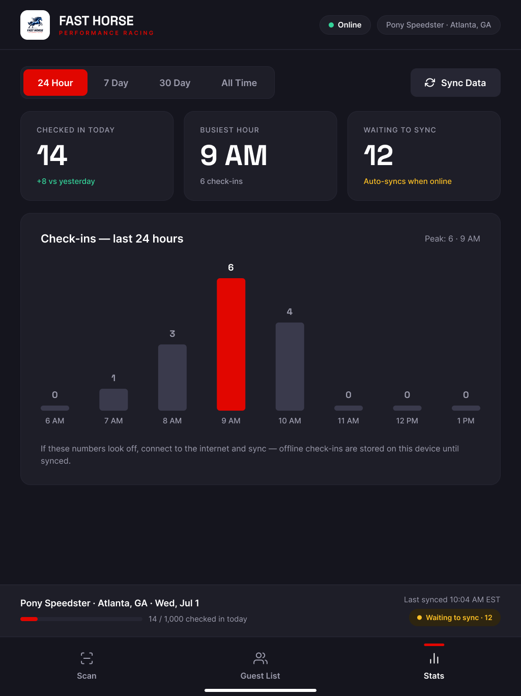
Racetracks have terrible connectivity, so the system is offline-first: check-ins store on the device and sync automatically when a connection returns, and the interface says so in plain language everywhere doubt could creep in — a visible “waiting to sync” count in the footer, on the stats dashboard, and inside the registration flow. The stats view gives event ops the day at a glance: check-ins against yesterday, the busiest hour, and the sync state.
Around the product I built the full brand and UI system — the carbon-and-racing-red identity, Space Grotesk for the broadcast voice, Inter for everything read at arm’s length — documented as v2.0 guidelines precise enough for the React implementation to follow without design supervision. The client’s own identity stays confidential; the Fast Horse rebrand carries the portfolio version.
What changed
The economics were the point, and they landed: after design and development, the system runs at roughly $9,000 a year all-in — software and equipment — against the $42,000 a year the SaaS route would have cost, a saving of nearly 80% annually. The training problem shrank with it: a check-in station that new local staff can operate correctly in their first minutes replaces a paper process that had to be re-taught every event weekend.