2021
Netflix — UX Concept
A one-week, self-initiated UX study of Netflix’s help experience — rethinking the FAQ and footer where the world’s biggest streamer answers its hardest questions.
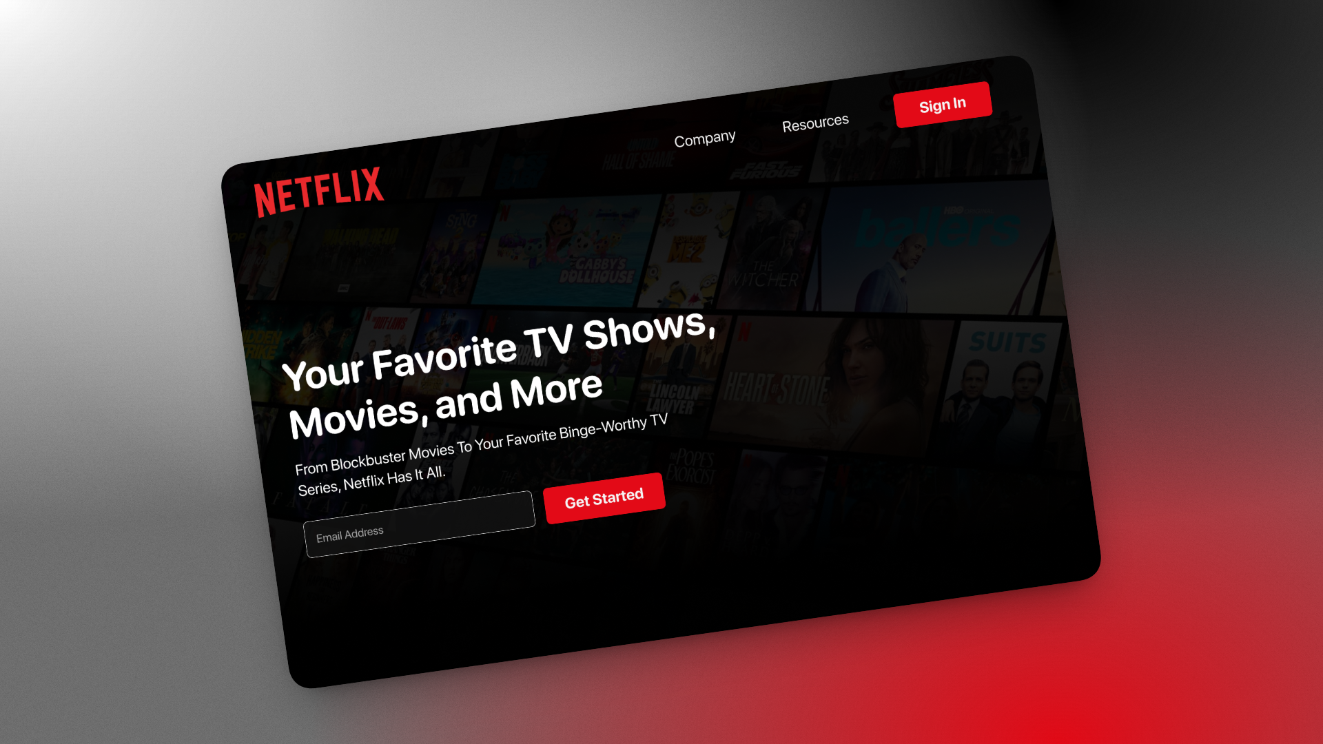
This is a self-initiated design study from 2021, entirely unaffiliated with Netflix. I gave myself one week and one question: where does the world’s most polished streaming product still confuse people? The answer was the landing page itself — so I redesigned it end to end: hero, features, FAQ, and footer.
The problem
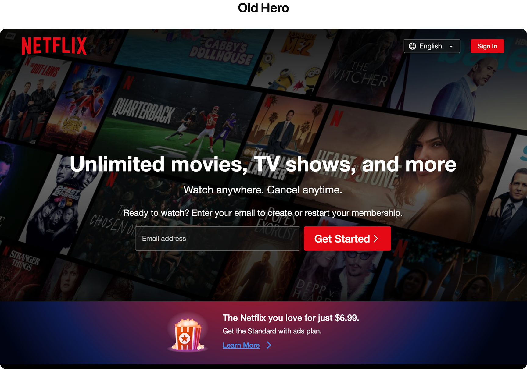
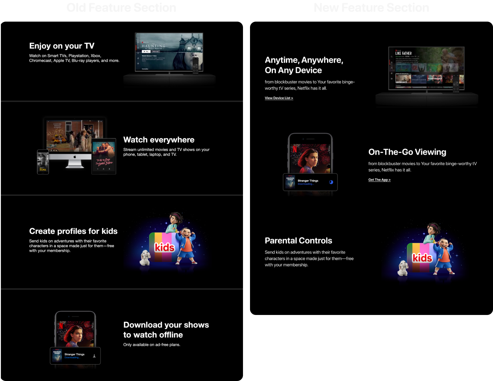
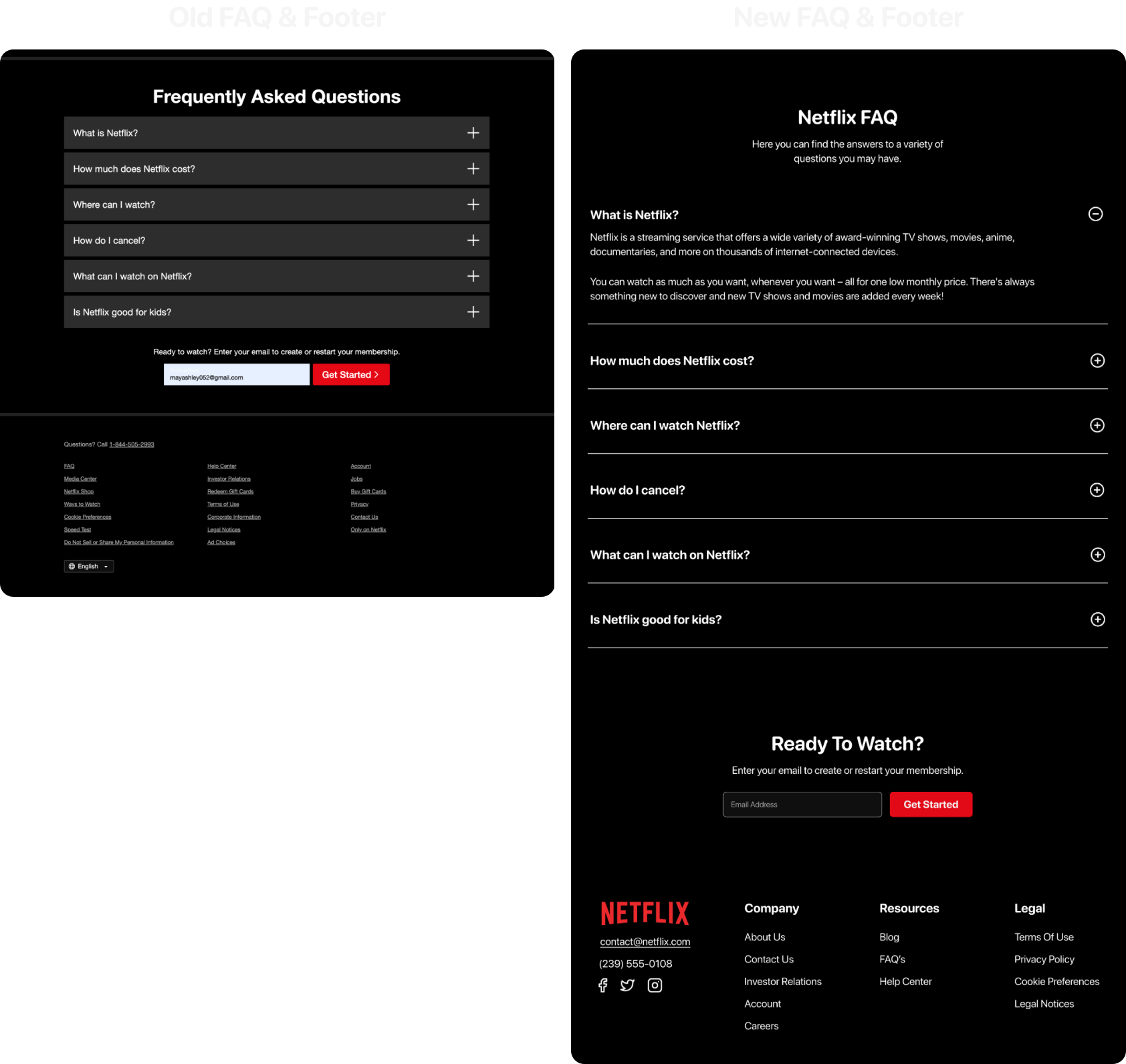
Studied closely, the shipped landing page works against its own single goal. The hero makes three asks at once — a language selector, three stacked lines of copy, and a promotional banner all competing with the email form. The features section reads as an inventory of facts rather than reasons to subscribe. The FAQ hides every answer behind a closed box, and the footer dumps thirty undifferentiated links into anonymous columns. None of it is broken; all of it is friction on the one page whose only job is conversion.
What I did
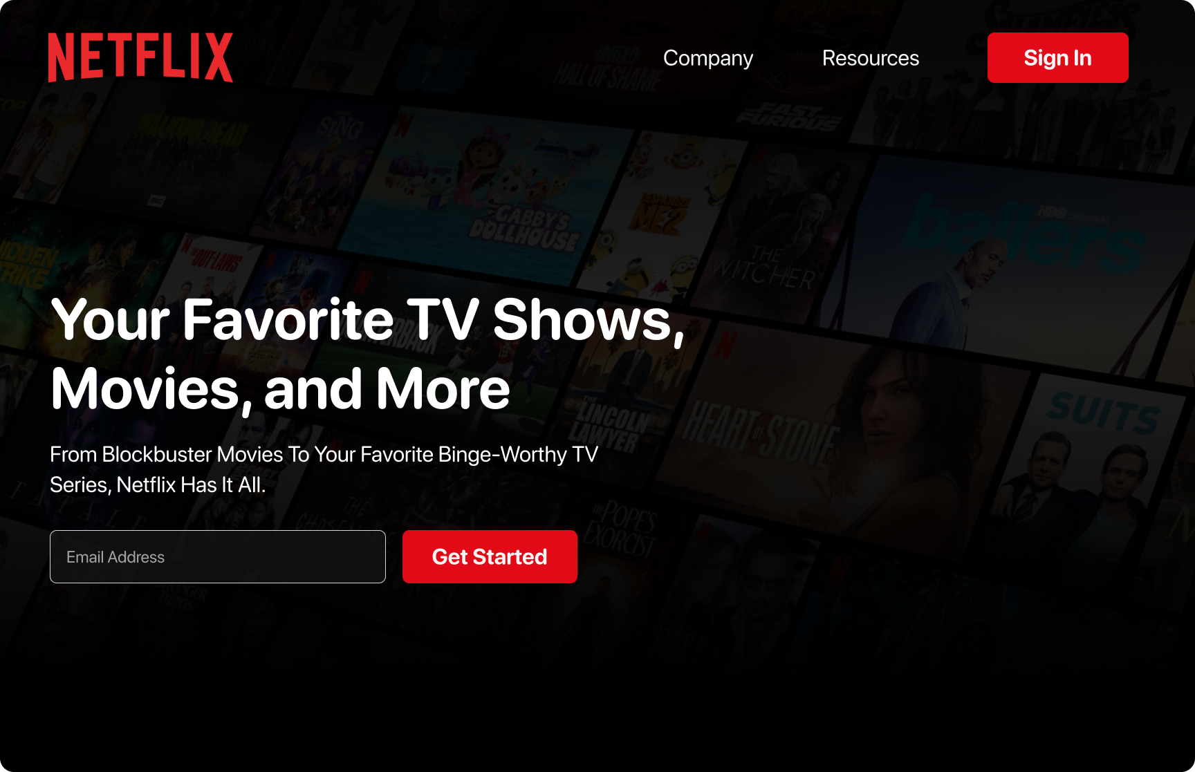
The redesign treats the whole page as one argument. The hero strips to a single promise and a single action — three-item nav, a headline about the content instead of the terms, the email form alone at the center — with the poster wall dimmed into a backdrop. The features section is rewritten from inventory to outcomes, each block earning an inline next step: view the device list, get the app.
The FAQ opens its first answer by default so the section demonstrates usefulness instead of promising it, and the closing call to action becomes a moment of its own. The footer is rebuilt as a real index — Company, Resources, Legal, and actual contact details. All of it inside a deliberately tight system: SF Pro Rounded in two weights, six neutrals, and exactly two reds, so the concept reads as Netflix refined rather than Netflix replaced.
What changed
As a fictional project, the outcome was the discipline itself: one week, a narrow scope, and the exercise of improving a world-class product without breaking its brand. It remains a favorite demonstration of how much UX opportunity hides in the pages nobody screenshots.