
20 Aug 2026 — 10 min read
I Started Playing Elden Ring and Ended Up Building the Companion I Wanted
Follow along on my journey of the lands between and the companion tool that I needed to play the game I love! It's an ongoing project that I work on when I have time, and it's extremely close to my heart!
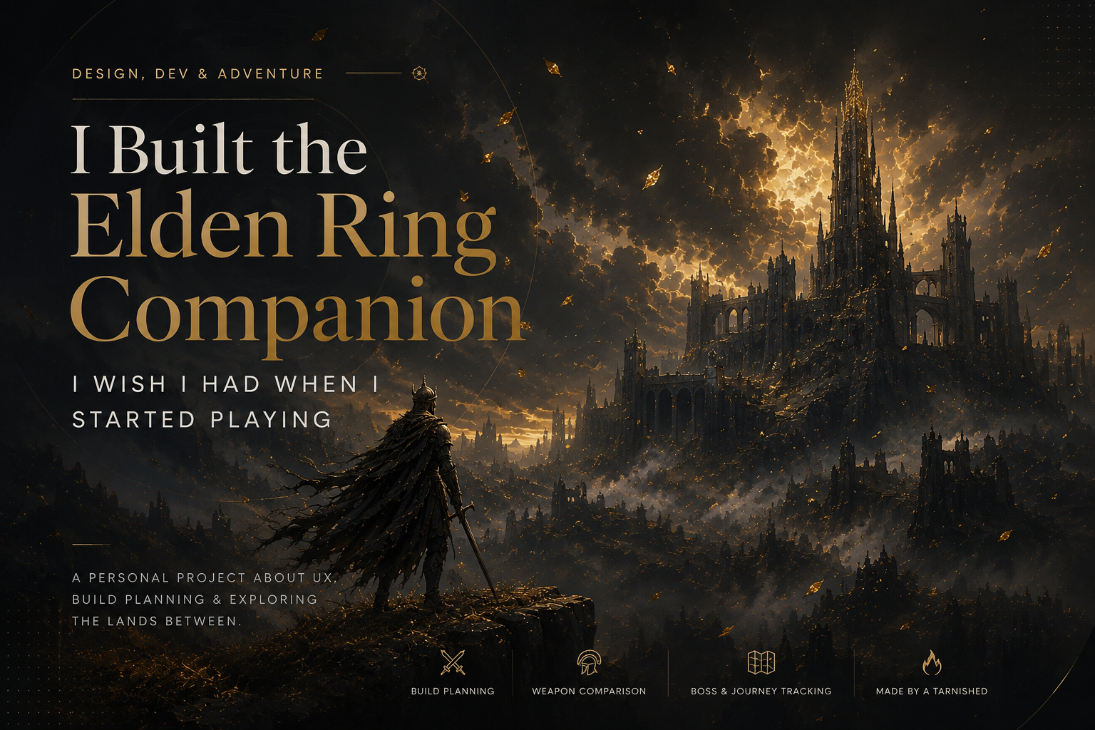
I picked Elden Ring as the first real PC game I had played in my adult life.
That probably wasn’t the smartest decision, but I like to live on the FAFO side of life! So in true FAFO fashion I found out, and finding out helped me create the tool I needed and wanted for the game I love!
I hadn’t seriously played a video game since I was a kid, and somehow I decided to jump back into gaming with a Souls game. Not exactly the genre known for welcoming new players with open arms. Elden Ring is hard. The combat is hard, figuring out where you’re supposed to go can be hard, understanding your stats can be hard, and figuring out whether the cool new weapon you just found is actually better than the one you’ve been using can be surprisingly hard. But that’s also what made me love it. The more I played, the more I started noticing something that was separate from the game’s actual difficulty. A lot of the frustration I was experiencing wasn’t because the game was supposed to be difficult. It was because some of the information I needed wasn’t particularly easy to understand or compare. And as a UX/UI designer and frontend developer, once I started noticing those problems, I couldn’t really stop thinking about them. So I built a tool to help myself.
It Started With Weapons
One of the first things that bothered me (and apparently the rest of the online community as well) was weapon comparison. Elden Ring has an incredible number of weapons, and there are a lot of things that can make one weapon better for your particular character than another. Damage, scaling, attributes, requirements, weight and other characteristics all matter. The problem is that comparing those things isn’t always a great experience. You can look at one weapon and then another, but you’re often relying on yourself to remember what you just saw. You’re looking back and forth instead of being able to easily evaluate two options side by side. For someone who already knows the game inside and out, that might not be a huge problem. For someone who is learning how the entire system works while playing the game, it is. I kept thinking about what a good comparison experience would look like if I were designing it as a web application. What if I could put two weapons next to each other and immediately see the differences? What if the things that changed were visually obvious? What if I could understand not just which weapon had the bigger number, but which one actually made more sense for my build? That was one of the first ideas that started the project.
Then I Started Getting Lost
Press enter or click to view image in full size press enter or click to view image in full size journey screens for the unofficial Elden Ring Companion. Showing a breakdown of graces, the users journey, and the bosses. Filter based on critical path, key bosses, and see a list of every boss ands grace by area of the lands between. The other problem was progression. Elden Ring gives you an enormous amount of freedom. That’s one of the best things about the game. You can go somewhere completely unexpected, discover an area you weren’t supposed to find yet, fight a boss that absolutely destroys you, leave, come back twenty hours later and somehow win. I love that. But when you’re new to the game, it can also be difficult to understand where you are within the larger journey. The map does a good job showing your Sites of Grace and the markers you place yourself, but it doesn’t necessarily give you a clear picture of your character’s progression through the world. If you don’t already know where every Grace is, where every boss is, which bosses are optional and which ones matter to the story, it’s easy to lose the larger context of what you’re doing. I found myself asking questions like, “Is this boss important?” or “Am I supposed to be here yet?” or “Did I completely miss something? ”I didn’t necessarily want the game to give me a checklist telling me exactly how to play. Part of Elden Ring’s appeal is figuring things out for yourself. What I wanted was context. I wanted to be able to look at my journey and understand where things fit.
That’s Where the Companion Came From
Eventually I started building what became my Elden Ring Build Planner & Companion. I didn’t start with the idea that I was going to build some definitive Elden Ring database or compete with the enormous number of resources that already exist for the game. I was building the tool that I wanted to have while I was playing. That distinction is important. There are already plenty of places where you can look up a weapon, a boss, an item or a stat. The problem I was interested in was what happens when all of that information needs to come together to help you make a decision. That’s a UX problem. A build isn’t just a collection of stats. A weapon isn’t just a collection of numbers. A boss isn’t just an entry in a database. Everything exists within a larger context. The companion is my attempt to make that context easier to understand.
Making the Bosses Make Sense
One of the parts I’m particularly interested in is how the companion organizes bosses. Instead of treating every boss as another item in a giant list, I wanted to give them some context. The application can separate bosses into categories such as field bosses, main bosses, story-critical encounters and bosses that only appear at night. You can also filter the experience down toward the critical path through the game. That last part is especially important to me .I’m not trying to turn Elden Ring into a linear game. I don’t want to remove the exploration or discovery that makes it fun. I just want to make it easier for a player who doesn’t already have the entire game memorized to understand the structure of what they’re experiencing. If I want to wander around and fight random bosses, I can. If I want to understand which bosses are actually important to progressing through the story, I can do that too. The information should support the way I want to play rather than dictate it.
Designing for Someone Who Doesn’t Know Everything
Press enter or click to view image in full size press enter or click to view image in full size press enter or click to view image in full size journey screens for the unofficial Elden Ring Companion. Showing a breakdown of build comparisons, weapons comparison, and build discrepancies for players who need the extra help selecting the right weapons and armor when it comes to the build they want to achieve. There’s something interesting about building a tool for a game that you’re still learning yourself. Usually, when you’re designing software, you try to understand the user as much as possible before you build. You create personas, conduct research, identify pain points and try to understand the user’s mental model. With this project, I was the user. I was learning the game while simultaneously trying to design around the things that confused me. That gave me a perspective I actually found really valuable. When I didn’t understand something, I couldn’t just assume the user would understand it. When I had to look somewhere else to find information, I could ask why. When I couldn’t figure out what something meant, I had a very immediate UX problem sitting right in front of me. I’m still learning Elden Ring, so the project is evolving as my understanding of the game evolves.
The Project Is Also an Experiment in How I Build Software
The project is built with TanStack Start and hosted on Railway. I’ve been increasingly interested in the space between UX design and frontend development, and this project gave me a chance to work across that entire spectrum. I wasn’t just designing screens in Figma and handing them off to somebody else. I was figuring out the information architecture, designing the interactions, building the interface, working through the data and then actually using the product. That last part is probably the most important. When you build something yourself, you don’t get to hide behind a handoff. If the interaction feels awkward, I have to deal with it. If the hierarchy isn’t working, I see it. If I can’t find something, I have to ask myself why I designed it that way in the first place. That feedback loop is one of the reasons I enjoy building these kinds of projects.
It’s Definitely Not Finished
The current version is what I would call a fancy prototype. It works, and there are parts of it that I’m really happy with, but there is still a lot of work to do. The UX needs improvement. The UI needs improvement. Some interactions need to be reconsidered. Some information could be presented more clearly. There are also plenty of features I’d eventually like to add to the companion. But I’m deliberately not trying to build everything at once. Right now, I’m more interested in making what already exists better. I think that’s an important part of building products that can get lost when it’s so easy to generate new features. More functionality doesn’t automatically make something more useful. Sometimes the best thing you can do is take the thing you already have and make the experience dramatically better. That’s where my focus is right now.
Why I Wanted to Build This
The funny thing is that this project started because I was bad at a video game. Or at least, because I was new to one. I was trying to understand my character, figure out what weapons I should use, remember where I had been and understand what I was supposed to do next. As a designer, I couldn’t help seeing those frustrations as opportunities. A weapon comparison problem became a UX problem. A progression problem became an information architecture problem. A character planning problem became a data and interaction problem. And suddenly this game that I was struggling to understand became a really interesting design exercise. That’s one of the things I love about personal projects. They don’t always need to start with some grand business idea. Sometimes they start with, “This is annoying. I think I can make it better.”
Building Something While Learning
I also think there’s something valuable about building this as someone who isn’t an expert Elden Ring player. I’m learning the game. I’m learning its systems. I’m learning where I still get confused. And I’m learning what information I actually need when I’m making decisions. The companion gets to evolve alongside that process. As I learn more about the game, I’ll discover new problems to solve. I’ll probably redesign things I thought were finished. I’ll probably remove things that seemed like good ideas at the time. And I’ll undoubtedly find new features that I want to add. That’s okay. I’m not trying to pretend that version one is the final product. I’m interested in the process.
What’s Next
Eventually, I want the companion to do more. I’d like to expand the build planning and optimization capabilities, improve weapon comparisons, add more progression functionality and continue finding ways to connect the player’s build with their journey through the game. But those things will take time. For now, I’m focused on the fundamentals. Make the existing UX better. Make the interface clearer. Make comparisons easier. Make progression easier to understand. Make the information feel useful instead of overwhelming. Then build from there.
The Bigger Lesson
This project has reminded me why I like UX so much. Good UX isn’t necessarily about removing complexity. Sometimes the complexity is the product. Elden Ring is complicated because there are hundreds of interconnected systems, and that’s part of what makes the game interesting. I don’t want to remove that complexity. I want to make it easier to navigate. That’s the same problem designers face in almost every complex digital product. The information already exists. The challenge is figuring out how to organize it so that a person can actually use it. For me, Elden Ring just happened to be the system I wanted to tackle. And honestly, I think that’s why this has been such a fun project. I started playing a game I’d never played before, got frustrated by the way some of its information was presented, and decided to build the tool I wished I had. It’s still a work in progress. It’s still a little rough around the edges. But it’s mine, it’s useful to me, and it’s giving me a completely different way to learn both the game and my craft. And for now, that’s enough.
Try the Elden Ring Build Planner & Companion: https://elden-ring-build-planner-optimizer-production.up.railway.app/
Built with TanStack Start. Hosted on Railway. Use my code to start using Railway in your next deployment! https://railway.com?referralCode=thedesignerdev
Visit my portfolio to follow along with the FAFO Files, a collection of my personal projects where I do just that and find out what I can… and can’t do next! From success, to ongoing projects, and all the way to my tremendous failures the FAFO files will eventually have it all!